In the world of property investment, identifying early signs of underperformance is as crucial as spotting the next hotspot.
Although in the long term (30+ years), all property markets tend to perform similarly, averaging 5-6% annual growth, their short-term performances can vary dramatically as each market runs in its own cycle.
Looking at cities across Australia today, you’ll see a divergence between certain areas experiencing robust recovery and others lagging.
Among those lagging behind regions is Richmond Valley – Coastal, the SA3 region of Byron Bay. Its median house price has been falling since late 2022, down -20.4% from Sep 2022 to the end of 2023 (chart below). In contrast, Greater Sydney, where house prices also declined as the cash rate rose, has been recovering since early 2023, now 5.3% higher than the last trough.
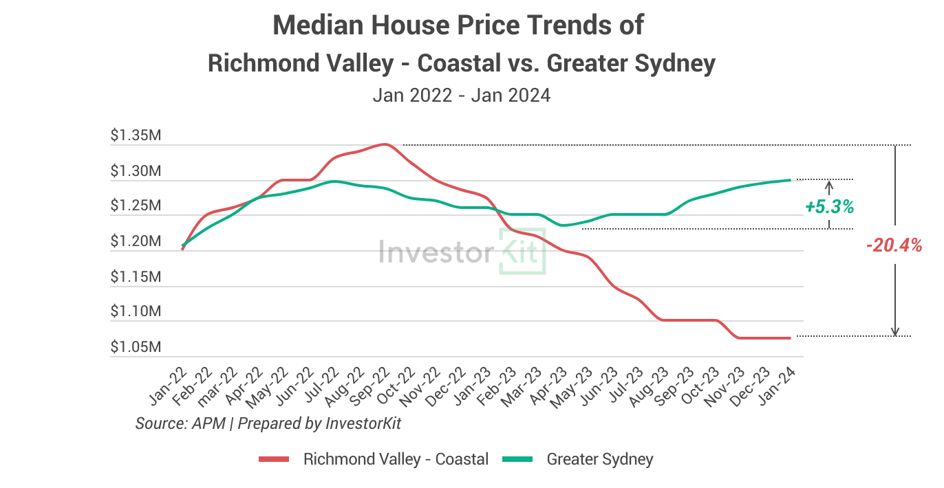
With prices declining by over 20% in just over a year, Richmond Valley – Coastal was undoubtedly an underperforming market in 2023. However, the question is, what happened before the decline? Were there any warning signs that could prevent investors from entering the market in early 2022 to avoid the massive value loss later on?
Yes, there were. In today’s article, let’s have a closer look at some key metrics that can help you identify soon-to-be underperforming markets for you to avoid poor short-term growth.
Sale Days on Market
Sale days on market (DoM) is the number of days a property stays on the market before being sold. Increasing DoM is a telltale sign of relieving market pressure. It indicates that properties are harder to sell due to lower demand or mismatched pricing expectations between sellers and buyers.
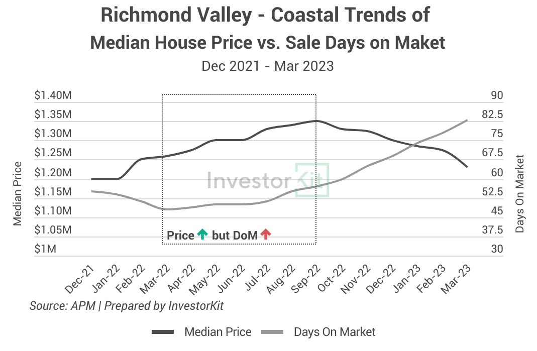
In early to mid-2022, while Richmond Valley Coastal’s house prices were still growing, its average DoM started to increase, indicating that the market was gradually losing pressure, which would eventually lead to stagnation or decline.
It’s vital to analyse DoM trends holistically. In other words, we need to examine not only the trends but also the static levels.
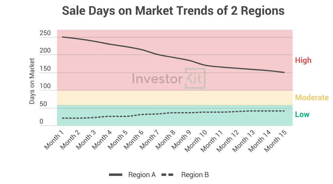
For instance, a decline from 250 to 150 in DoM is a dramatic drop (Region A in the chart below), a sign of increasing market pressure, but prices might not grow as fast as you may expect. Why? Because 150 is still a relatively high DoM, meaning that the market pressure, while improved, is not high enough to push prices to grow fast yet.
On the contrary, an increase from 20 to 40 in DoM is a big jump (Region B in the chart below), a sign of decreasing market pressure. However, prices might still be thriving instead of declining. Why? Because 40 is still a low DoM – the market pressure, while relaxed, is still healthy and will keep pushing prices up.
Housing Inventory Levels
As the ratio between the number of listings and the number of sales, inventory gives us a great insight into the relationship between demand and supply.
A balanced market typically sees a 3-4 months inventory level, meaning it would take 3-4 months to sell all current listings at the current sales pace. Inventory levels above 4 months suggest a weak market with excess supply over demand.
This metric is crucial in understanding the demand-supply dynamics and identifying areas with low market pressure that would lead to underperformance.
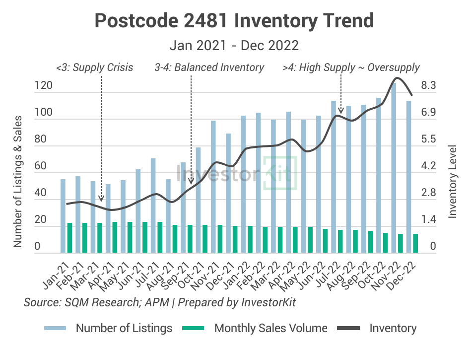
The chart below shows the inventory level of postcode area 2481 (the primary postcode area around Byron Bay).
The number of listings (supply) in the area has been trending up since late 2021, while the sales volume (demand) has gradually declined. As a result, this area’s inventory went from a crisis level of under 3 months of stock to 8+ months of stock in a year – That could be one of the most significant market pressure reliefs anyone had ever witnessed. That pressure relief finally resulted in the extensive price decline starting Sep 2022.
Vacancy Rates
Vacancy rate is the #1 indicator for a rental market’s demand and supply relationship. High or rising vacancy rates can be a red flag for rental growth, as it suggests the number of people looking to rent (demand) can’t keep up with the number of properties available for lease (supply).
An example is Melbourne City (chart below). The vacancy rate there rose fast from a low 1.3% in early 2023 to 3.4% at the end of the year. As the vacancy rate increased, rental pressure eased, and the rental growth slowed to a standstill in mid-2023.
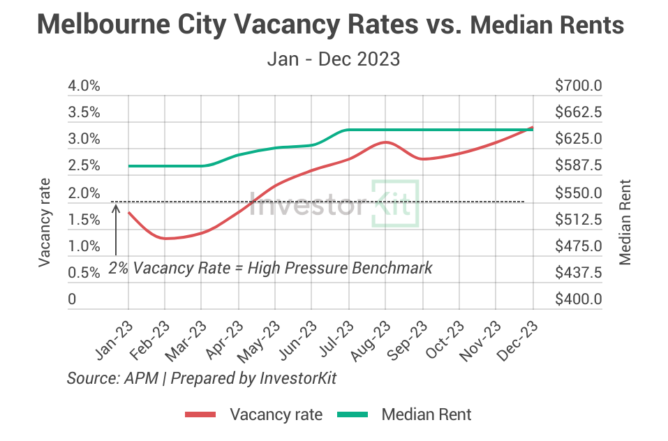
It’s important to note that rather than driving market conditions, vacancy rates reflect them, highlighting the balance between available properties and tenant interest: An uptick in vacancy rates indicates an excess of properties beyond what tenants need or want. In response to this, landlords might find themselves needing to reduce rent prices to attract tenants, which could adversely affect rental prices.
While low vacancy rates indicate heightened competition amongst tenants, which would drive up rents, it’s not a given. Similarly, rents can decrease even when vacancies are scarce.
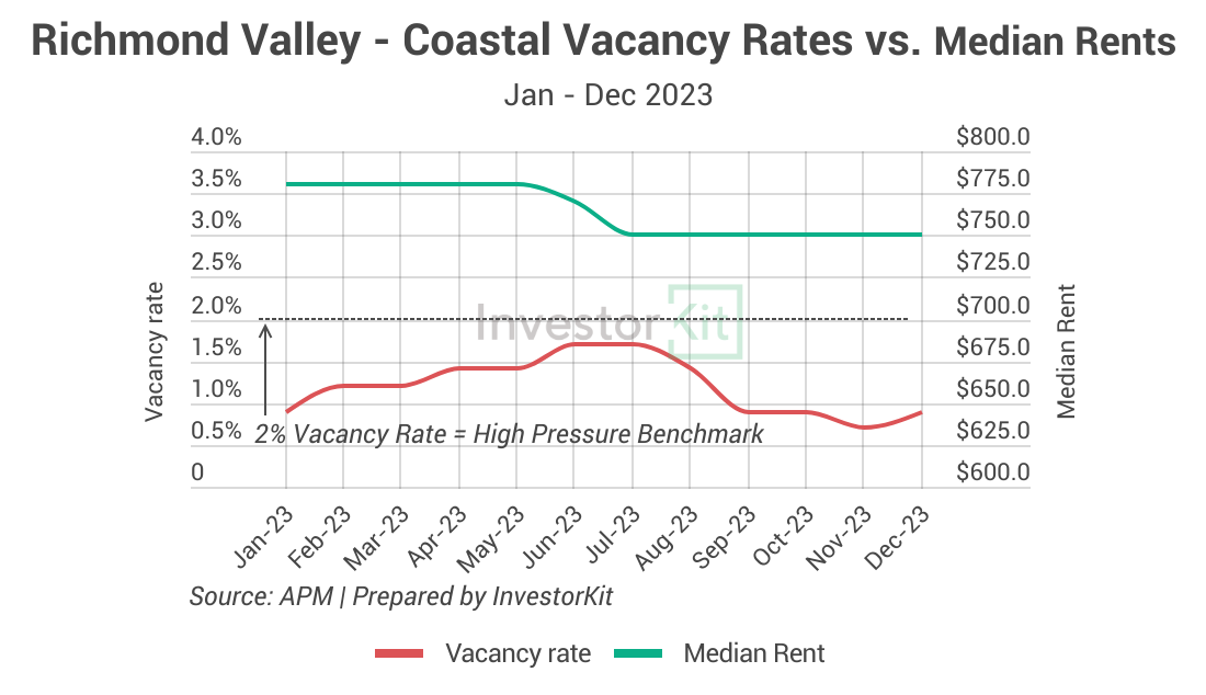
The Richmond Valley – Coastal SA3 is a good demonstration: the region’s vacancy rate was always under 2%, the commonly-held high rental pressure benchmark, in 2023. However, house rental prices didn’t see any growth and even declined briefly mid-year (chart below).
Joe’s Investment Misadventure: Lessons in Market Research
Joe, an enthusiastic but inexperienced first-time investor, was swayed by his friends’ decisions to buy properties in the Richmond Valley – Coastal area. Joe’s friend group was convinced the strong price growth from 2021 to early 2022 was a great sign, and investment success here was inevitable. The buzz among his social circle was that it was the next big thing in real estate, and Joe, not wanting to miss out, quickly jumped on the bandwagon.
However, unlike the savvy investors who delve into property data and market trends, Joe skipped doing his research and made his decision based more on hearsay. He was blissfully unaware of the key indicators that could have hinted at the area’s underperformance.
2023 rolled around, and the property market in Richmond Valley Coastal took a nosedive. The median price plummeted by 20%, a stark contrast to the healthy growth seen in other regions like Adelaide, Perth or regional QLD. Joe watched in dismay as his investment’s value decreased significantly.
Joe could have identified many warning signs of a weakening market early on – the increasing days on market, the surging inventory or even just the surging for-sale listings, etc. – had he used a data-based decision-making process, and avoided the significant value loss.
Don’t be like Joe…
Navigating the real estate market can be daunting, especially when it comes to market selection. Investorkit’s data-driven approach, grounded in market pressure analysis, is designed to help you save time and effort and, more importantly, sidestep pitfalls. By leveraging our expertise, you can confidently make informed decisions, ensuring your investments are positioned in markets primed for solid growth.
Want to discover how InvestorKit’s targeted research and bespoke services can align with your investment goals, or how we can safeguard your investments against the risks of underperforming markets? Connect with us today for a complimentary, no-obligation 15-minute discovery call!
Acknowledgement:
Thanks to Eli Cox for his invaluable assistance with chart preparation and drafting.
.svg)
