August 25, 2025
Reading the Property Clock: How to Look Beyond It and Invest Smarter
Many property investors regularly refer to Herron Todd White’s National Property Clock when trying to understand where different markets sit in their growth cycle. The Clock is clean, simple, and…
Many property investors, including our clients, regularly refer to Herron Todd White (HTW)’s National Property Clock when trying to understand where different markets sit in their growth cycle.
It’s one of the most widely circulated tools in the Australian property industry. Clean, simple, and visual, it gives a snapshot of house and unit markets across the country each month.
But here’s the challenge: it’s not always accurate.
Take the latest House Market Clock, for example:
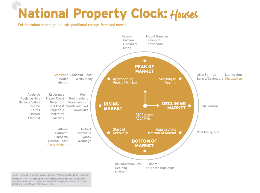
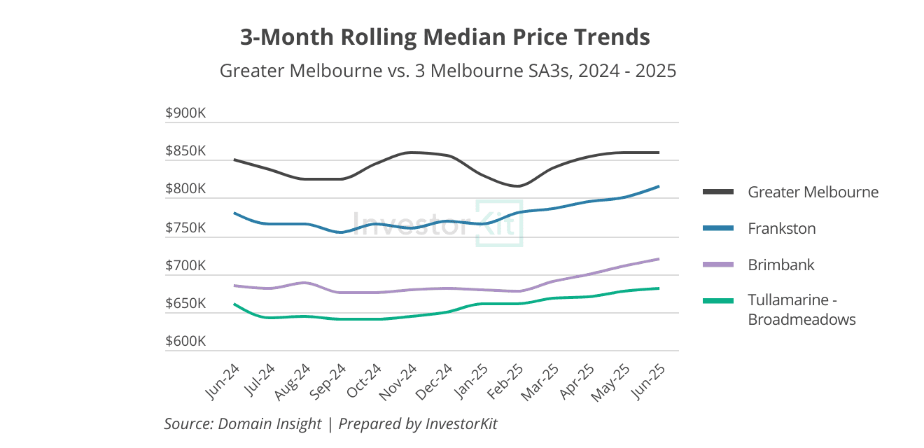
Melbourne is currently positioned as ‘Starting to Decline’, but it contradicts what many professionals and on-the-ground observers are seeing: House prices have been stagnant for more than 2 years at the Greater Capital City level, and have been increasing in many submarkets (the chart below shows some of them). It would make more sense to position it as ‘Bottom of Market’, if not ‘Start of Recovery’.
So, why the contradiction?
In today’s blog, let’s unpack how to read the Property Clock properly, and more importantly, how to pair it with leading indicators to make better, more confident investment decisions.
The Property Clock: A Simplified Tool, Not a Timing Device
HTW’s National Property Clock is one of the most shared and cited tools in the Australian property market. Each month, it summarises where major markets sit in their growth cycle, from ‘Approaching Peak’ to ‘Bottom of Market’ and ‘Rising’.
It’s neat and easy to read, but let’s be clear: it’s not a predictive tool. It is a simplified snapshot, and like all simplifications, it comes with limitations.
Here’s What the Clock Doesn’t Always Show You:
- It’s a lagging indicator.
The data used, such as sales and valuations, reflects what’s already happened, not what’s starting to happen now. - It is overgeneralised.
Cities aren’t single markets. The major capital cities, especially, contain dozens of submarkets, many of which move at different speeds and sometimes in different directions. - It leans conservative.
It’s understandable that valuers (including HTW) are measured in their calls. They would prefer to wait for clear confirmation of a trend, even if it means acknowledging a market shift after it has already started.
That’s why the Clock cannot capture many emerging trends on the ground, such as changes in stock levels, clearance rates, buyer activity, etc.
If you’re relying on the Clock alone, you might miss real opportunities or enter a ‘hot market’ at an unfavourable time.
Real Examples: Where We See Discrepancy
We have discussed Melbourne as an example at the beginning of the article. Here are two more.
Burnie: Labelled as ‘Starting to Decline’, But Already Recovering
Burnie is positioned as ‘Starting to Decline’ in the July Clock.
However, data shows that the softness has already played out. Today, prices have been steadily rising, inventory levels have been dropping (first chart below), vacancy rates are falling, and rental yields are improving (bottom chart below), all signalling increasing market pressure in both the sales and rental markets.
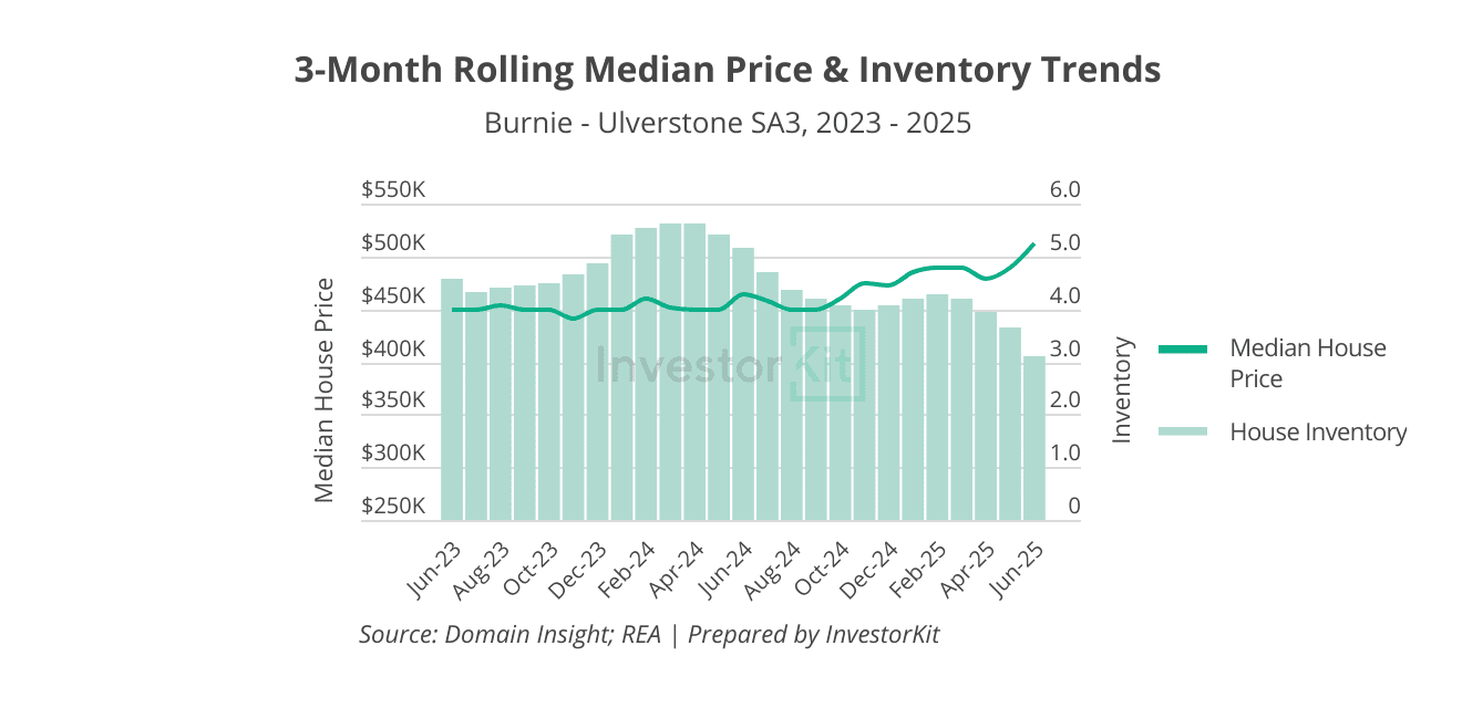
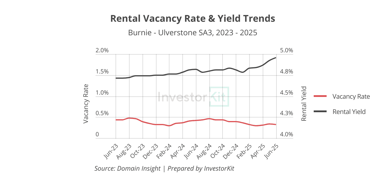
Rather than starting a decline, Burnie appears to be moving out of the trough and entering a recovery.
Perth: A Rising Market, But Not Everywhere
Perth, meanwhile, is listed in the ‘Rising Market’ phase. Overall, that’s still accurate – buyer activity remains strong, and demand continues to support the broader market.
However, if we zoom in, the nuance becomes clear.
Several submarkets, especially some affordable outer-ring areas, are showing signs of saturation. Supply levels have elevated (higher inventory levels, first chart below), buyer urgency is easing (rising days on market, first chart below), and price growth has slowed or plateaued (bottom chart below). In some of these pockets, it would be more precise to categorise conditions as at least ‘Approaching Peak’.
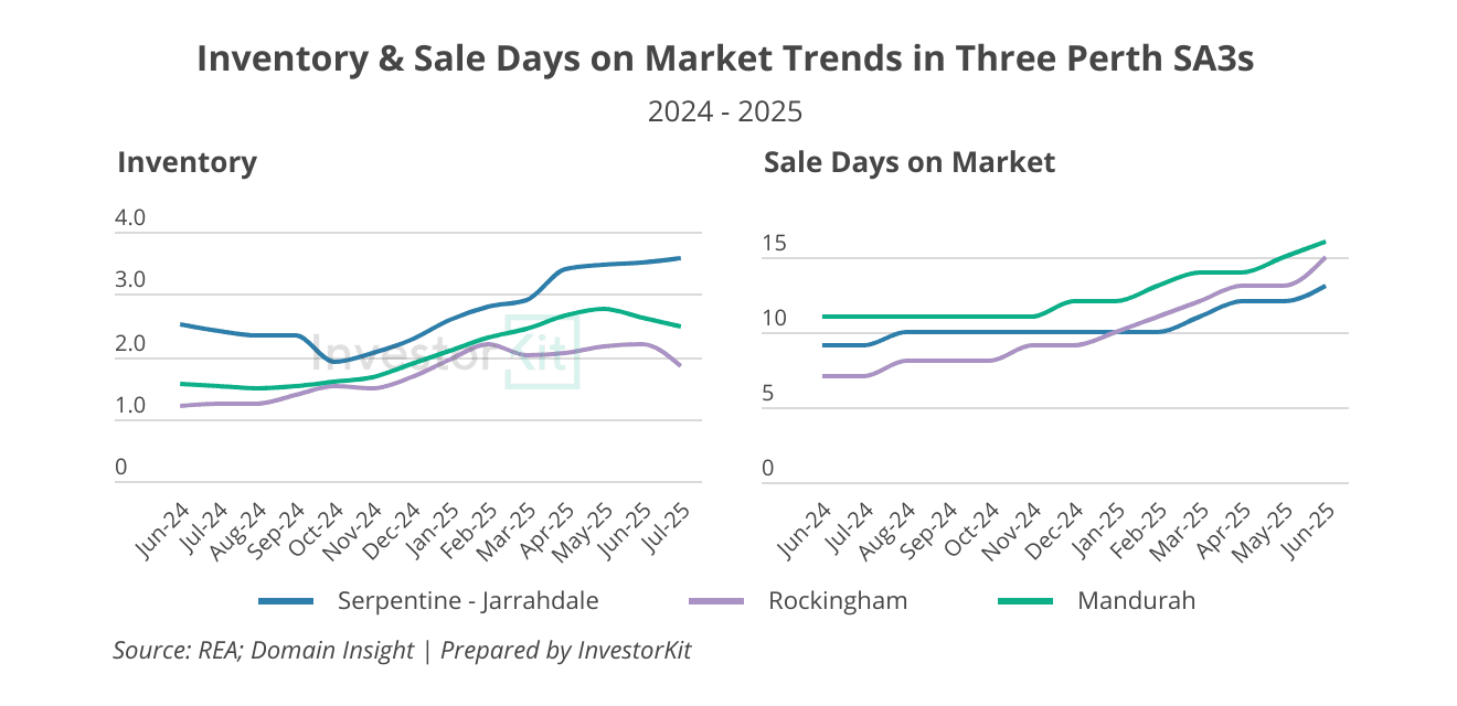
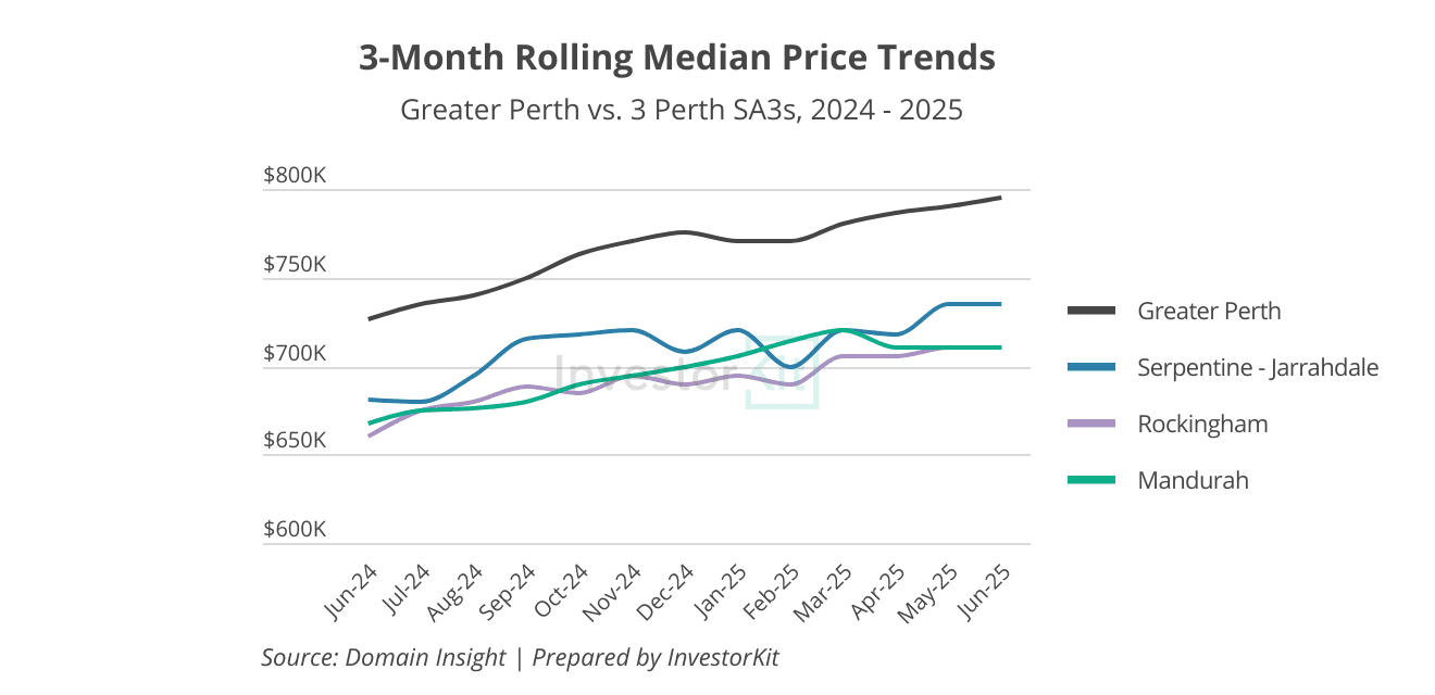
For investors relying solely on the Property Clock, Perth appears to send a clear ‘buy’ signal, but when you break it down, not all submarkets are performing equally.
So, What Would Be Better to Tell The Story?
Think of the Clock as a roughly drawn map: It serves the purpose of a broad indicator of market sentiment and cyclical positioning, but not 100% precise.
To navigate with precision? You need a compass.
Here’s what that compass looks like:
- Inventory levels: Falling inventory = tighter supply relative to demand
- Days on market: Faster sales = rising demand relative to supply
- Finance activities: More loan commitments = more buyers ready to act
- On-the-ground buyer activity: Higher clearance rates = more confident and active buyers
These are the leading indicators. When these signals shift, it means the market is starting to move, often months before valuation results reflect the change.
You Can Use the Clock As A Reference, But Don’t Be Ruled by It
If you take one thing away from this, let it be this:
The Property Clock reflects consensus. But smart investors act ahead of consensus.
By the time the Clock says “Rising”, many great buying opportunities may have been gone. Therefore, it’s essential to remember to read leading indicators instead of solely relying on the Property Clock.
At InvestorKit, we constantly monitor both leading and lagging indicators, decoding them and acting before the Property Clock reflects the trends.
If you’re feeling stuck in the cycle of second-guessing, analysis paralysis, or simply not knowing who to trust, let’s change that. Book a free 15-minute discovery call and learn how our data-led strategy can help you invest with clarity, confidence, and conviction.


